Today I couldn’t imagine traveling without Google Maps. While some remote locations are outdated or missing on map, visualizing the main infrastructure is crucial for travel safety. I often use Google Maps feature Layers which generally reflect collections of objects that you add on top of the map to designate a common association.
Hiking & bike trips
You can get directions for driving, public transit, walking, ride sharing, cycling, flight, or motorcycle on Google Maps. Reaching inaccessible sites by walking can be dangerous, especially on the roads with no sidewalks.
Google Maps offers features like Layers to mark the trails, dedicated lanes, bicycle friendly roads or unpaved trails on the map view. In some remote areas it isn’t accurate. In northern Germany, for example, the driveway stretches one third of the road separated apart from the sidewalk, which merges into the bike lane as the road continues. The road signs are the most reliable, but if you miss one Google Maps it will take unexpected turns for you in your journey.
Custom styling for the Google Layers will make your next road trip planning easier.
How to create custom Layers for Google Maps?
-
Use the legacy JSON styling wizard
-
Create Map Style
-
Settings - Import JSON
-
Copy/Paste JavaScript array from any template, e.g. https://snazzymaps.com/style/85450/monochrome-grey
Color themes
In a recent survey of 115 mobile users asking what mode they generally have their mobile device in, roughly 1/3 said dark mode, 1/3 said light mode, and 1/3 said a combination of both. The argument that dark mode improves the user experience (and accessibility in some cases) always seems to circle back to the same few reasons, mentioned by users, designers, and developers alike:
-
Reduced eye strain
-
Battery savings
-
Aesthetic appeal
-
Improved accessibility for those with visual impairments (e.g., cataracts)
Chromotherapy uses the power of colors to support our mental, emotional, and physical wellbeing, and it can be extremely important while driving with a car or measuring long distance.
In this article I listed a few templates that I recommend for Google Maps Web https://mapstyle.withgoogle.com/, or when embedding the maps on any website.
Topography Templates
The Propia Effect
Red, purple and orange color palette suitable for the dark theme. Link to the template.
Light Green
Light green colored theme highlights non-flat surfaces away from the urban environments. Link to the template.
Navigation
Light grayscale, monochrome theme highlights road location markers for the road trips with the car or the bicycles. Link to the template.
Colorblind-friendly
A stylized map based on the hues of a colorblind-friendly palette. People with various types of color deficiency, for instance, Tritanopia (blue color vision deficiency), Deuteranopia (green), Protanopia (red). Orange/red channel is best perceived regardless of the type of color blindness that a person has. It is at the end of the color spectrum and transmits maximum contrast, which is not lost when color perception is altered. Link to the template.
Areas of Interest Highlight
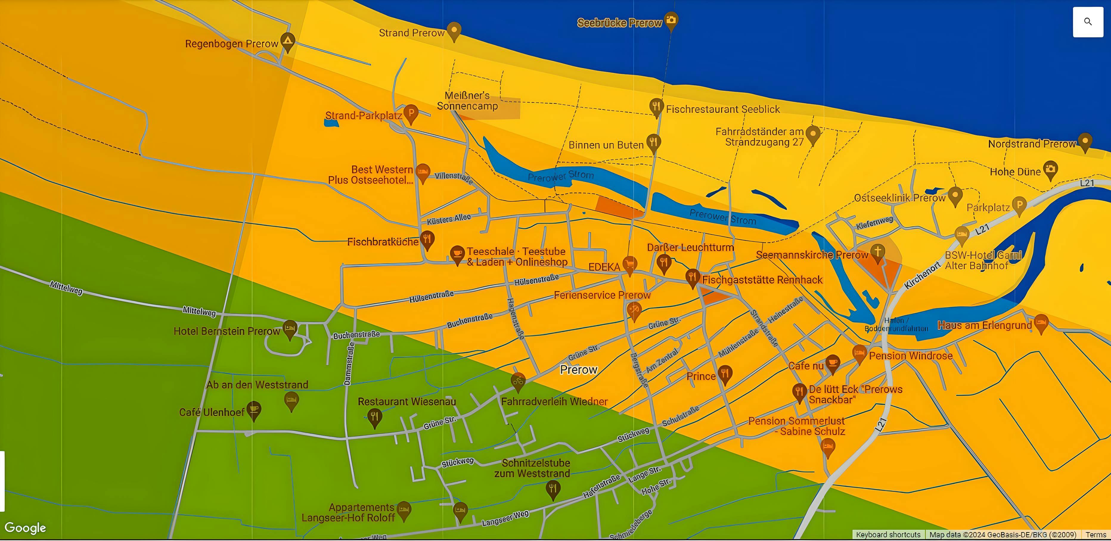
This style is intended to highlight the copper-colored “areas of interest”. It is useful to cluster the area into the groups of activities. Link to the template.
Tip: filtering areas by keywords in Google reviews categorizes interests and answers questions related to route planning.
Rail network and stations
Highlighting the rail network, sea lane and stations. Link to the template
Natural Navigation
Great for use on sites to mark the main roads from the cycling infrastructure. Link to the template.
RoweMap
Pastel pink, purple, grayscale monochrome color palette, color saturation and lightness is relative to the level of map zoom. Link to the template.
BestTrip
Light green, monochrome colors, simplified map with markers for hiking areas and trails. Link to the template.
USGS Topo 1946
Two-tone monochrome color map based on a USGS topo map circa 1946, highlighting waterways, parklands, and natural features. Useful for marking historical topographic collections. Link to the template.
Biking secondary roads
Highlights roads and trails suitable for bicycles, link to the template.
Maps simplified
Maps simplified are not labelled and are great for adding custom markers or art prints and posters.
Tour
A simple map, with highways, state and country boundaries, and topography included. No parks/reservations/etc. are identified, no labels are included. Zoom in for the road line width adjustments. Link to the template.
Mapiful
Mapiful style theme ideal for map posters of any city, link to the template.
Picoteo Malaga
Mapiful style theme ideal for markers of local businesses, link to the template.
Greyscale w/water
Greyscale and teal colored map with the high contrast between water channels, link to the template, similar theme.
Light Blue Water Simple
Minimal, grayscale, light blue colored map, link to the template.
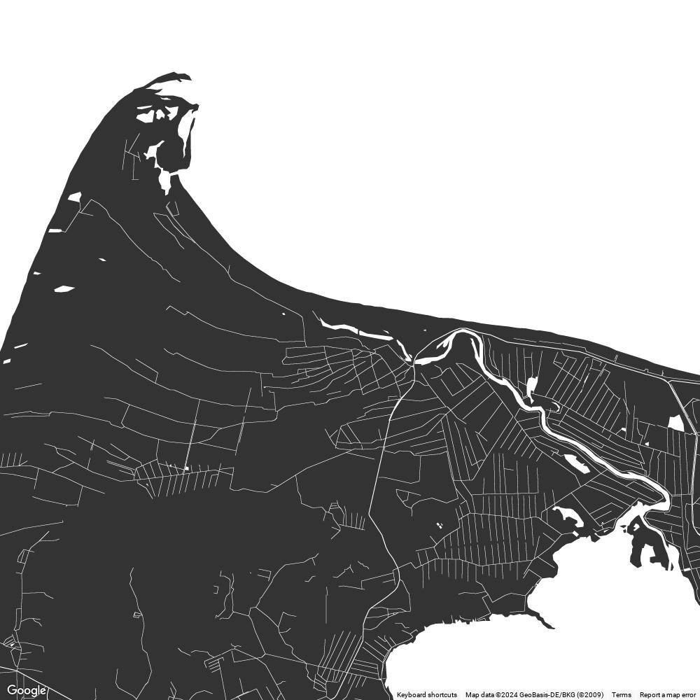
MonoChrome Grey
Minimalistic, monochrome, grey colored map, link to the template.